Many assume that pink paint colors are too bold or feminine for modern homes. Yet Vintage Vogue by Benjamin Moore proves otherwise. This muted dusty rose, part of the brand’s Historical Collection, offers a subtle warmth that works in both traditional and contemporary spaces.
How Benjamin Moore Developed the Historical Collection
In 1976, Benjamin Moore launched the Historical Collection to capture authentic colors from early America. The company researched historic documents, including paint chips from old homes and records from the 18th and 19th centuries. Over 140 colors were selected, each with a story. Vintage Vogue, coded HC-63, was among them. The collection aimed to provide homeowners with shades that felt both nostalgic and livable. The process involved careful analysis of original pigments and period-accurate formulations. Today, the collection remains a staple for those seeking classic, enduring hues. benjaminmoore.com/en-us/paint-colors/color/462/vintage-vogue” rel=”noopener noreferrer” target=”_blank”>Vintage Vogue 462 | Benjamin Moore
Key Milestones in Vintage Vogue’s Popularity
Vintage Vogue first appeared in the 1976 Historical Collection launch. It remained a niche choice for decades, favored by restoration enthusiasts. In the early 2010s, the color gained broader attention as interior designers embraced blush tones for accent walls and bedrooms. By the mid-2010s, it became a go-to for romantic, vintage-inspired interiors. The rise of cottagecore and soft femininity in home decor further boosted its appeal in the 2020s. Social media platforms like Pinterest and Instagram featured the color prominently, cementing its status as a modern classic.
Why Vintage Vogue Works in Interior Design
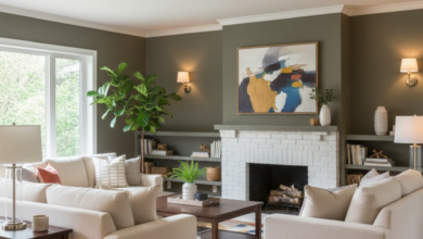
Designers praise Vintage Vogue for its versatility. The color is often described as a faded rose or antique pink, with warm undertones that prevent it from feeling cold. It pairs beautifully with neutrals such as cream, beige, and soft gray. In bedrooms, it creates a cozy, romantic atmosphere. In living rooms, it adds subtle depth without overwhelming the space. Powder rooms benefit from its intimate feel. The shade also complements natural materials like wood and linen. Its ability to shift in different lighting—appearing more beige in bright light and rosier in dim light—adds to its charm.
| Feature | Details |
|---|---|
| Color Name | Vintage Vogue |
| Color Code | HC-63 |
| Collection | Historical Collection |
| Launch Year | 1976 |
| Undertone | Warm, dusty rose |
| Common Uses | Bedrooms, living rooms, powder rooms |
Common Misconceptions About Vintage Vogue
Some believe that Vintage Vogue is a bright, bubblegum pink. In reality, it is a muted, dusty shade with significant gray undertones. Others think it only suits traditional decor, but it works equally well in modern minimalist spaces. Another misconception is that the color is difficult to pair. On the contrary, it complements a wide range of hues, from deep navy to soft sage. Finally, some assume it is a recent trend. Vintage Vogue has been available since 1976, proving its lasting appeal.
Frequently Asked Questions
Why did Benjamin Moore name the color Vintage Vogue?
The name evokes a sense of timeless fashion and elegance, aligning with the color’s antique pink character. It suggests a classic, stylish look that never goes out of style.
Who is the designer most associated with using Vintage Vogue?
No single designer is exclusively linked to the color. However, many interior designers, including those featured in home decor magazines, have used it in projects that emphasize soft, romantic aesthetics.
Where can I buy Vintage Vogue paint?
Vintage Vogue is available at Benjamin Moore retailers across the United States and Canada. It can also be ordered online through the Benjamin Moore website or authorized dealers.
What is Vintage Vogue best known for in interior design?
It is best known for its versatility as a muted blush pink that adds warmth and sophistication to any room. Designers value it for creating cozy, inviting spaces without overwhelming the senses.
When did Vintage Vogue first become popular?
While introduced in 1976, it gained widespread popularity in the early 2010s as part of a broader trend toward blush and rose tones in home decor. Its resurgence continues today.
How to Incorporate Vintage Vogue in Different Rooms
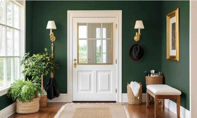
In a bedroom, Vintage Vogue works well on all four walls for a cocooning effect. Pair it with white trim and natural wood furniture for balance. For a living room, consider using it on an accent wall behind a sofa or fireplace. It also shines in a home office, where its calming presence can boost focus. In bathrooms, the color adds a spa-like warmth, especially when combined with brass fixtures and soft lighting. Even kitchens can benefit—try it on kitchen island cabinetry for a subtle pop of color that feels intentional rather than loud.
What Paint Finishes Work Best with Vintage Vogue
The finish you choose affects how the color reads. For walls, an eggshell or matte finish softens the dusty rose and minimizes imperfections. In high-traffic areas like hallways, a satin finish offers durability while retaining a gentle sheen. For trim and doors, a semi-gloss finish in a crisp white creates contrast. Ceilings painted in a flat finish of the same color can make a room feel more enveloping. Always test samples in your space, as lighting dramatically alters the perceived depth of Vintage Vogue.